US City
Pocatello is famous in the small world of flag design, and for years it was famous for the wrong reason: it flew what was voted the worst city flag in North America — two blurred mountains, the slogan “Proud to Be Pocatello,” and, hard as it is to believe, a trademark symbol. The mockery, capped by a 2015 TED talk seen by millions, finally pushed the city to start over. In 2017 Pocatello adopted a clean new flag — red peaks, a golden star and the line of the Portneuf River on blue — and turned itself into vexillology’s favourite redemption story. Here is how it happened.
Click on a country to learn more
| City | Pocatello, Idaho — the “Gate City” |
|---|---|
| Old flag | Created c. 2001 by the Chamber of Commerce: two blurred mountains, the slogan “Proud to Be Pocatello,” and a ™ symbol, on white |
| NAVA 2004 survey | Ranked last of 150 United States city flags — reported as the “worst in North America” |
| Redesign | Flag committee convened April 2016; 709 designs submitted from 26 countries and 31 states |
| New flag adopted | 20 July 2017, by the City Council |
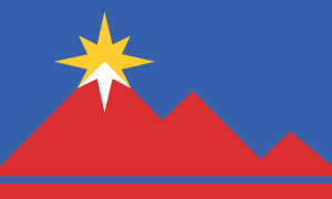
| New flag design | Blue field; three red peaks (Scout Mountain, Kinport Peak, Chinese Peak); a golden compass rose with a white snowy summit; base stripes for the Portneuf River and the sky |
Pocatello’s first flag was never really designed as a flag. It was created by the Pocatello Chamber of Commerce around 2001 and flown unofficially: two blurred purple triangles for the mountains nearby, each cut with a row of little notches, and beneath them the words “Proud to Be Pocatello” set in two different typefaces on a white ground. Off to the side, next to the slogan, sat a small ™ trademark symbol — a marketing logo turned into a civic banner.
In 2004 the North American Vexillological Association surveyed 150 United States city flags and ranked Pocatello’s dead last. The press shortened that to “the worst flag in North America,” and the trademark symbol became a byword for everything a flag should not be. The verdict reached a wide audience in 2015, when the designer Roman Mars devoted a TED talk to bad municipal flags — watched by millions — and held Pocatello up as the cautionary example.
Rather than bristle at the ranking, Pocatello used it. Prompted by the renewed attention after the TED talk, the city convened a flag committee in April 2016 and opened the design to anyone. By the close of submissions on 2 December 2016 it had received 709 entries from 26 countries and 31 states — an extraordinary response for a city of about 55,000.
The committee worked the submissions down to a winner, and the Pocatello City Council adopted the new flag on 20 July 2017. In little more than a decade the city had gone from the bottom of the national rankings to a textbook case of how to fix a flag — the rare place whose banner is now praised precisely because it was once mocked.
The new flag of Pocatello — three red peaks on blue, a golden compass rose over the tallest, and the line of the Portneuf River below. Adopted 20 July 2017.
The new flag is everything the old one was not: a few bold shapes, no words, no logo. On a blue field stand three red triangles for the mountains that ring the city — Scout Mountain, Kinport Peak and Chinese Peak — and above the tallest sits a golden compass rose, which most people read simply as a star, with a stroke of white for the snow on the summit.
Along the foot of the flag run stripes for the Portneuf River and the sky. The compass rose is not only an ornament: Pocatello grew as a railroad junction through the mountains of southeastern Idaho, the “Gate City” between the plains and the Northwest, and the rose speaks to that history of transportation and trade. It is a flag a child can draw and a stranger can read — the test the old one failed.
Because in the North American Vexillological Association’s 2004 survey it ranked last of the 150 U.S. city flags rated. The old flag put two blurred mountains and the slogan “Proud to Be Pocatello” on a white ground — and carried a trademark symbol.
Yes. The old flag, made by the Chamber of Commerce around 2001, included a small trademark symbol beside its slogan — a detail vexillologists cite as everything a flag should avoid. It featured in Roman Mars’s 2015 TED talk on flag design.
On 20 July 2017, after a redesign begun in April 2016 that drew 709 entries from 26 countries and 31 states.
Three red peaks stand for Scout Mountain, Kinport Peak and Chinese Peak; a golden compass rose (read as a star) with white snow sits atop the tallest; and base stripes stand for the Portneuf River and the sky.
Because it grew as a major railroad junction through the mountains of southeastern Idaho — a gateway between regions. The compass rose on the new flag nods to that role.
Last reviewed by the Emblema Mundi editorial team on 16 September 2026.