Prefecture
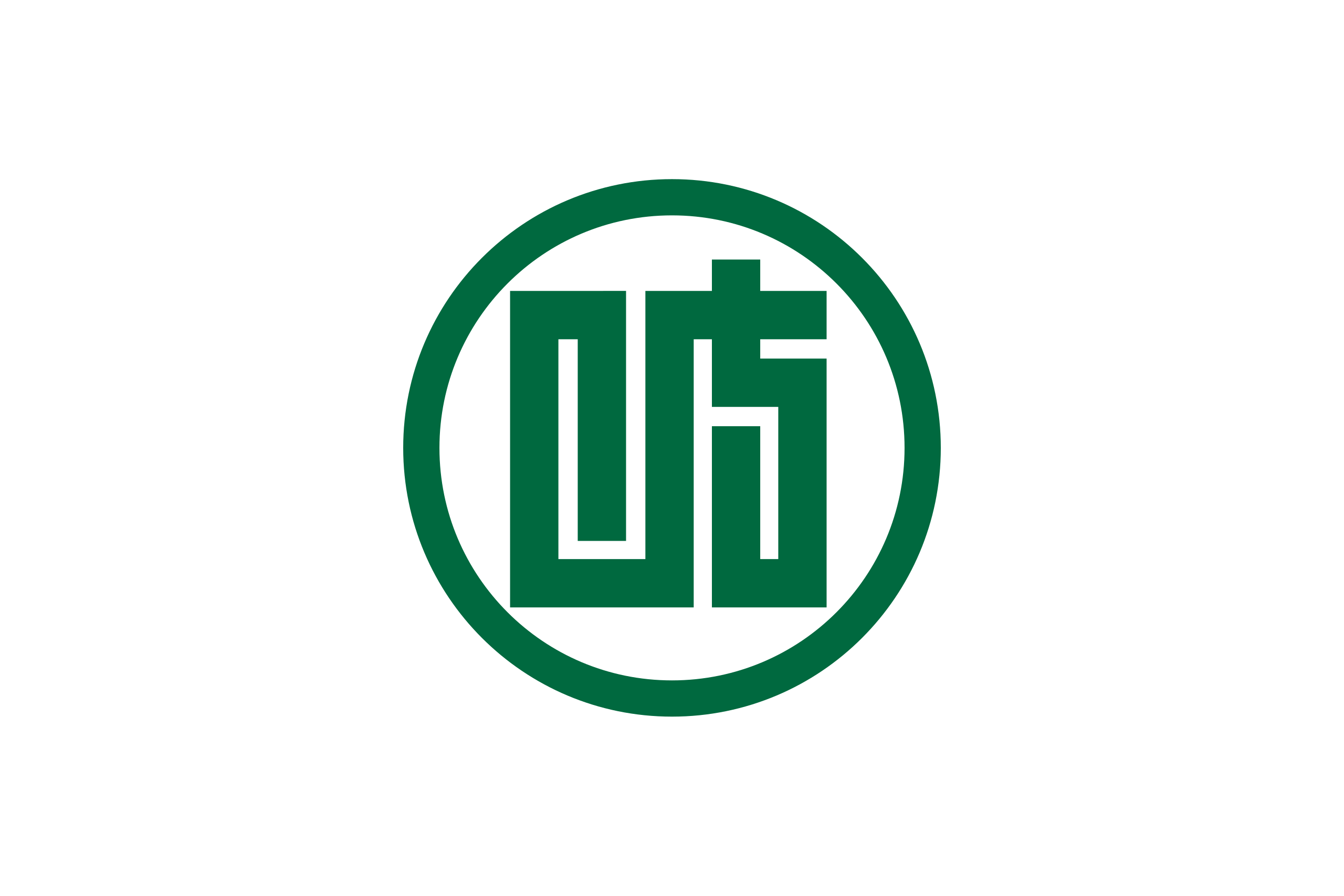
Gifu Prefecture (岐阜県, Gifu-ken) flies a white flag bearing a green emblem: a stylised, simplified form of the character 岐 (gi) — the first character of the prefecture’s name — enclosed in a circle. Adopted in 1932 after a public design competition, it is said to represent the peace and harmony of the prefecture’s people, with green standing for the region’s natural beauty. A separate, more modern five-colour symbol mark stylising the letter “G” was added in 1991. Note that Gifu Prefecture’s capital city is also named Gifu — but the city has its own, distinct municipal emblem, not covered here.
Flag
Not available
| Prefecture | Gifu (岐阜県, Gifu-ken) |
|---|---|
| Type | Ken (県) — ordinary prefecture |
| Region | Chūbu (Tōkai subregion) |
| Capital | Gifu City (a separate municipal entity with its own emblem) |
| Established | 1871 haihan-chiken reforms; present borders formed 21 August 1876 by merging former Mino and Hida Provinces |
| Crest (kensho) | Green character 岐 (gi) in a circle, on white; adopted 10 August 1932 (Notice No. 424) |
| Symbol mark | Five-coloured stylised “G”; adopted 22 November 1991 (Notice No. 695) |
| Official tree | Japanese yew (ichii), designated 1966 |
| Official flower | Chinese milk vetch (renge), chosen March 1954 |
| Official bird | Rock ptarmigan (raichō), designated 1965 |
| Official fish | Ayu (sweetfish) |
Flag of Gifu Prefecture — White field, green “gi” character in a circle, adopted 1932
The flag of Gifu Prefecture is a white field bearing the prefecture’s green emblem (県章, kenshō): a simplified, stylised rendering of the character 岐 (gi) — taken from the first character of “Gifu” — set inside a circular ring. According to the prefectural government, the enclosing circle expresses the peace and harmony of the prefecture’s people, while the green colour represents Gifu’s natural beauty. There is no formal ordinance governing the flag’s exact proportions or use, but the convention of the green emblem centred on a white field is long-established.
The emblem was formally adopted on 10 August 1932 (Shōwa 7) by Prefectural Notice No. 424, following a public design competition open to residents. Several independent sources (including the prefectural government’s own historical notes and Japanese-language reference works) note an interesting detail: the design ultimately adopted was not the competition’s first-place entry, but a refined version of the second-place submission. Because the underlying archival record of the competition is not fully documented in English, this detail should be read as a well-attested but not universally corroborated tradition.
Gifu Prefecture itself was formed in stages during the Meiji era: the 1871 haihan-chiken reforms abolished the old feudal domains, and after several intermediate reorganisations, the prefecture reached its modern form on 21 August 1876, when it absorbed the short-lived Chikuma Prefecture (covering the former Hida Province) into the existing Gifu Prefecture (covering the former Mino Province). The prefecture’s name itself derives from its capital, reputedly named by the warlord Oda Nobunaga during his 1567 campaign to unify Japan.
Alongside the historic 1932 emblem, Gifu Prefecture adopted a modern symbol mark on 22 November 1991 (Notice No. 695). The design stylises the letter “G” for Gifu using five colours — yellow, green, blue, red, and white — alongside the English lettering “Gifu”. The prefectural government describes it as expressing an image of the prefecture “growing strongly, from point to line, and from line to plane” — a visual metaphor for outward, expanding development. Unlike Tokyo, Gifu has not adopted a separate flag bearing this newer mark; it is used mainly for promotional and administrative branding rather than as a flag.
Because the prefecture and its capital share the same name, it is easy to conflate their symbols. Gifu Prefecture’s emblem (described above) is the mark of the prefectural government, used on the prefectural flag and in official prefectural communications. Gifu City (岐阜市), the capital, is a separate municipal government with its own distinct city emblem and city flag, adopted independently by the city assembly. This page, and the flag image shown here, refer only to the prefectural emblem — not the city’s.
A white field bearing a green emblem: a stylised, simplified form of the character 岐 (gi) enclosed in a circle, representing the peace and harmony of the prefecture’s people, with green symbolising its natural beauty.
No. Gifu Prefecture and its capital, Gifu City, are separate levels of government, each with its own official emblem. This page covers only the prefectural emblem and flag, adopted in 1932. Gifu City has its own, separately adopted municipal emblem.
The prefectural emblem was formally adopted on 10 August 1932 (Notice No. 424), chosen through a public design competition. Prefectural sources note the final design was a refined version of the competition’s second-place entry.
The Japanese yew (designated 1966, traditionally used for ceremonial scepters presented to the Emperor), the Chinese milk vetch (renge, chosen 1954), the rock ptarmigan (raichō, designated 1965), and the ayu (sweetfish), celebrated alongside the Nagara River’s traditional cormorant fishing.
Last reviewed by the Emblema Mundi editorial team on 2026-07-04.