Prefecture
Aomori (青森県, Aomori-ken) flies a white flag bearing a deep-green crest (県章, kenshō) that is nothing more, and nothing less, than the prefecture’s own outline — the Tsugaru and Shimokita peninsulas curving around Mutsu Bay, reduced to a simple silhouette. Both flag and crest were adopted together on 1 January 1961. Note that the prefectural capital is a city that also happens to be called Aomori; that city government has its own, entirely different municipal emblem, described further below.
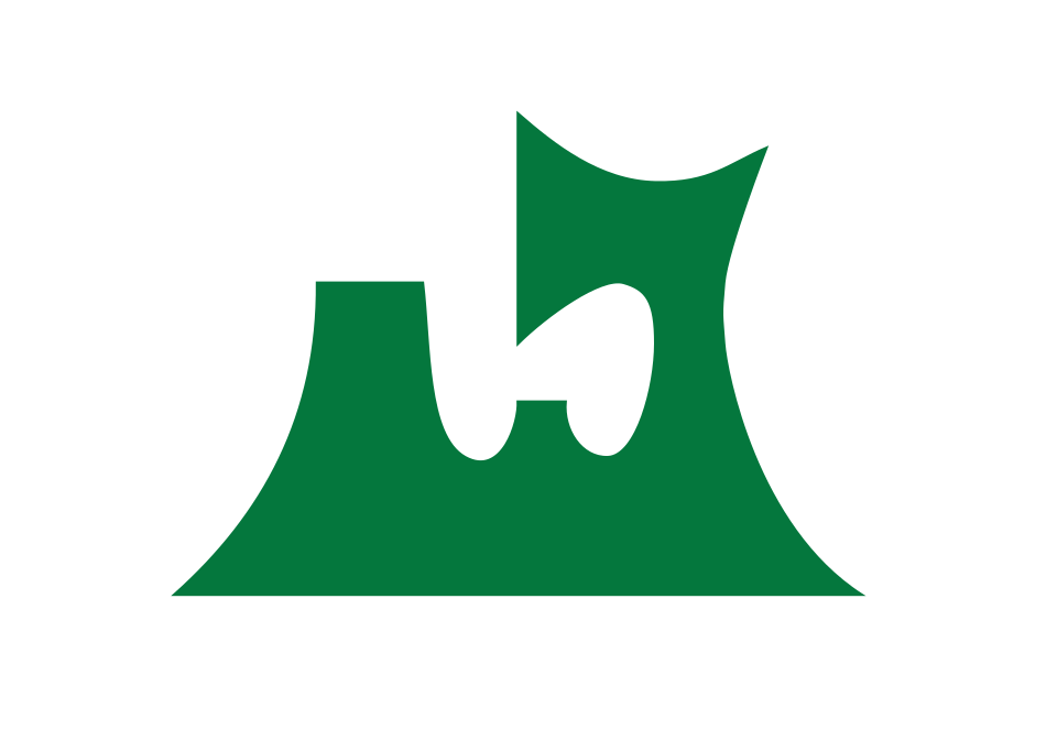
Flag
Not available
| Prefecture | Aomori (青森県, Aomori-ken) |
|---|---|
| Type | Ken (県) — ordinary prefecture |
| Region | Tōhoku, northern tip of Honshu |
| Capital | Aomori City |
| Established | 1871, in the haihan-chiken reforms; briefly organised as Hirosaki Prefecture (July 1871) before being renamed Aomori and its seat moved to Aomori City, 23 September 1871 |
| Crest (kenshō) | Deep-green stylised silhouette of the prefecture’s outline on white; adopted 1 January 1961 (Prefectural Notice No. 6) |
| Official tree | Hiba (Hinoki asunaro), designated 1966 |
| Official flower | Apple blossom, designated 1971 (prefecture’s centenary) |
| Official bird | Bewick’s swan (hakuchō), designated 1964 |
Flag of Aomori Prefecture — White field, deep-green crest, adopted 1961
The flag of Aomori Prefecture is a white field bearing the prefecture’s deep-green crest (県章, kenshō): a simplified silhouette of the prefecture’s own territorial shape, in which the Tsugaru Peninsula and Shimokita Peninsula curl around Mutsu Bay like a pair of pincers, or, as it is often described locally, an axe-head. According to the Aomori Prefectural Government’s official description, the white background represents “an infinitely expanding universe,” while the deep green of the crest symbolises “hope and a future of ceaseless advancement and development.”
Unlike many Japanese prefectural crests, which render an abstract mon, a stylised kana character, or a family badge inherited from feudal rulers, Aomori’s crest is a direct, simplified tracing of the prefecture’s own coastline. The design and its accompanying flag were formally established together on 1 January 1961 (Shōwa 36), by Prefectural Notice No. 6, which also fixes the flag’s proportions at a height-to-width ratio of 7:10. Aomori’s available regulatory sources do not name an individual designer or describe a public design competition, unlike Tokyo’s 1989 symbol mark; the crest appears to have been adopted directly as an administrative emblem representing the prefecture’s geography.
Because the prefecture’s capital city is itself named Aomori (Aomori-shi), it is easy to conflate the two governments’ symbols — but they are unrelated designs. The prefectural crest described above, in use since 1961, belongs to the Aomori Prefectural Government and represents the entire prefecture’s territory. Aomori City, by contrast, adopted its own separate municipal emblem on 27 April 2005, following a merger with neighbouring towns; the city’s emblem is a stylised rendering of the kanji 青 (“ao,” meaning blue/green), in which a circular form evokes the moon and seven points recall the Big Dipper, symbolising the city’s position at Honshu’s northern edge. This page and the flag illustrated above concern only the prefecture’s emblem.
A white field with a deep-green crest that is a simplified silhouette of the prefecture’s own shape — the Tsugaru and Shimokita peninsulas curving around Mutsu Bay. The white ground represents an infinitely expanding universe, and the green shape represents ceaseless hope and development.
No. They are two separate official emblems for two separate governments that happen to share a name. The prefecture’s crest (adopted 1961) is a green map-like silhouette of the whole prefecture. Aomori City’s own municipal emblem (adopted 2005) is an unrelated design: a stylised rendering of the kanji 青 with a circular moon motif and seven points recalling the Big Dipper.
The prefectural crest and flag were formally adopted together on 1 January 1961, by Prefectural Notice No. 6.
The hiba (Hinoki asunaro, designated 1966), the apple blossom (designated 1971 to mark the prefecture’s centenary, reflecting Aomori’s status as Japan’s top apple producer), and the Bewick’s swan (designated 1964).
Last reviewed by the Emblema Mundi editorial team on 2026-07-04.